
Project Type
UX Design, Redesign,
Web Design
Timeline
2 weeks
Role
Sole UX Designer (DesignLab Bootcamp)

Background
During my time at DesignLab, I had a capstone project that was centered around website design. Initially, I was unsure what I wanted to design but I remembered a website that hasn’t had any major redesign despite the growth of UX design since I started using it: Wikipedia.
Wikipedia’s mission has always been to “The mission of the Wikimedia Foundation is to empower and engage people around the world to collect and develop educational content under a free license or in the public domain, and to disseminate it effectively and globally.”
I thought about why Wikipedia hasn’t had a major redesign. Maybe it is because they are part of a nonprofit organization and haven’t had the resources. Or maybe they never felt the need for a redesign. Regardless, I decided to do some research on my own to discover its strengths and weaknesses.


Empathize
Research
SWOT Analysis
User Interviews
Affinity Map
Heuristic Evaluation

Define
Persona Creation
Task Flow

Ideate
Updated Task Flow
Sketches

Design
Mid-Fidelity Wireframes
High-Fidelity

Testing + Iteration
Usability Test
Affinity Map
Iterations
RESEARCH
During the research phase, I wanted to know more about Wikipedia itself, users' experience with the current design of the site, and how it stands against established design practices.
SWOT Analysis
In order to get a quick understanding of Wikipedia's strengths and weaknesses and how it compares to other similar websites, I conducted a SWOT analysis.

Based on my observations, Wikipedia has a lot of information to offer but its main weakness lies in how information is presented. The next step will to be to see what its users think.
User Interviews
To validate the observations made during the SWOT analysis, I decided to conduct user interviews. I interviewed people who use Wikipedia regularly and observed them while they used the website to learn about their behaviors and feelings.

“There is too much text. This makes me feel overwhelmed.”
“Having so much text about different things in my face makes me not want to read it.”
“Growing up, I was taught that Wikipedia is unreliable because anyone can make edits.”
Affinity Map
With the information I gathered from interviews and testing the original design on my users, I organized it using an affinity map to help me find common patterns regarding their experience with the current design.

INSIGHTS
-
users do not use the ‘Table of Contents’ even though it is supposed to help them find information faster
-
users didn’t notice or ignored any pop-ups/notices that appeared on the screen
-
users liked how much information Wikipedia had to offer but also found it overwhelming
-
users did not feel compelled to read the content on the homepage
-
users have only visited Wikipedia’s article pages
Heuristic Evaluation
In order to get a deeper understanding of how Wikipedia stands against today’s standards, I conducted a heuristic evaluation against Jakob Nielsen's 10 general principles for interaction design with the information I had previously gathered.
DEFINE
After compiling all my research, I had a clearer understanding of my users’ goals and what problems they were facing.
While my users expressed many concerns with the current design, I decided to center my redesign around the most important ones.
The reliability of Wikipedia
Users felt overwhelmed when seeing pages with a lot of text and information
Confusion with the different types of editors and getting started with editing
Persona
Most of my users are casual readers who usually prefer to consume content. They have little experience with editing but would like to know more about the process. To help me tailor my design for these users, I created a persona to help illustrate their goals, motivations, pain points, and needs.
Task Flow
To help me understand how users go through to edit Wikipedia in the current design, I decided to create a task flow of the process.

After looking at the task flow, I remembered that the users I interviewed are not regular editors of Wikipedia and decided to leave the flow of the editing process untouched.
However, I thought it would be valuable to look into the process of understanding and learning about the different types of editors as my users had a lot of trouble with this.

Currently, Wikipedia offers a lot of valuable information to its users. However, casual readers have some issues with the way information is presented to them. They are interested in being able to quickly find reliable answers to their questions with minimal effort and learning about how they can quickly get started with editing as a beginner.
IDEATE
Updated Task Flow
Currently, users can freely edit the site even without an account. Even though the content that is edited and added is moderated by Wikipedia administrators and not every article can be freely edited, users are still concerned with the reliability of the website’s content because they are not aware of this.
One part of my solution to provide more transparency of the contributors that make changes to the articles is to require users to login before doing so.

Sketches
Next, I created sketches to quickly come up with different solutions to the problem.
DESIGN
Mid-Fidelity Wireframes
After drawing out some sketches, I refined my design a bit more by creating mid-fidelity wireframes. This helps me focus more on the content and its placement first.

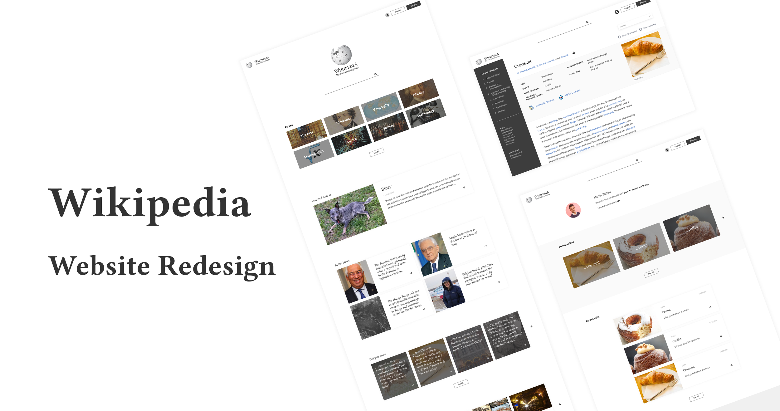
High-Fidelity UI Screens
Once I had my mid-fidelity Wireframes, I moved on to high-fidelity UI screens and refined the design even more. I added UI elements to help establish the new feeling and mood of the redesign. The result is a set of screens that accurately represent my redesign of Wikipedia.

TESTING AND ITERATION
Usability Test
To ensure my redesign is effective and helps solve the problems my users have with the original design of Wikipedia, I conducted some user testing.
Specifically, I wanted to
Learn about users’ reactions and feelings towards the redesign
Assess their understanding of the content that is being presented to them
How quickly they are able to find information
How quickly they are able to understand information
Validate assumptions I made after my user interviews
How users perceive the ‘Talk’ label for suggesting changes
What users think of the side navigation on articles
Affinity Map
After usability tests, I organized all the notes I gathered into an affinity map.

The most common issues my users shared with the first iteration of the redesign were
The revisions were more contributor centric so users were confused as to what kind of information is presented
With the way the actions are currently set up, users are not able to see its potential value, especially the ‘Show Footnotes’ section
Once users land on a wikipedia page, they typically prefer to start reading right away. The large header picture prevents them from doing so
Iterations
After learning about the common issues my users had with the design, I prioritized them from most to least important and made the following changes
Condensing the info box and header image to make better use of space and allowing users to get to the information they need quicker
Separating contributors from revisions, making it more intuitive and quicker for users to find information about those who wrote the articles
Moving “Show Footnotes” out of the drop down menu so that users can use it more effectively and efficiently

A cleaner layout that gives users a pleasant reading experience while allowing them quick access to verification of information
Cleaner layout and more imagery to help users digest large amounts of text easily
More transparency of contributions made to articles
More clarity on the different types of editors available
Quick and easy way for users to find and validate information on the site

When it comes to redesigning a website that has stayed pretty much the same for a long time it is especially important to:
-
Be aware of how much one is changing the placement of content Long time users will expect to find things in their original location and changing this can negatively affect the design
-
Think about the reasons why a redesign hasn’t already happened Research is very important to aid in this and help uncover any pain points users have with the current design


Redesigns are tricky because changes require time to get used to and people generally find change uncomfortable.
After the redesign has been rolled out, it is important to monitor:
how users respond to it (customer satisfaction)
how well they are using the new design to address their previous problems
If users were able to find the information they needed faster
If users are aware of the different methods they can now utilize to validate the information they read from the site
Whether pages that were previously not used much (e.g. homepage) are being used more often (conversion rate of unpopular pages)
We will know whether the redesign was truly successful if our redesign are able to achieve these things.